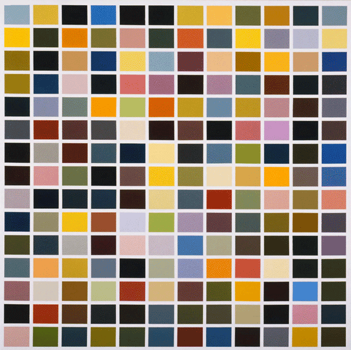
180 Farben (180 Colors), Gerhard Richter, Philadelphia Museum of Art
180 Farben (180 Colors)
While studying at the University of the Arts, one of my writing assignments was to sit and stare at one painting for an hour, take notes and write an essay.180 Farben (180 Colors) is included in the sensational International Pop exhibition at the Philadelphia Museum of Art, I sat with the painting again for a long while, alone at a press preview. The painting is very large, 6 feet 6 3/4″ × 6 feet 6 3/4″, enamel paint on canvas, there is a bench nearby, and while observing a wave of emotion washed over me. It was like visiting an old friend that was in the middle of telling a story. That writing assignment changed the way I look at art, spending time allows the conversation between the artist and the viewer to gel. Sixty minutes is a long time, there is a lot to be said.
Painting is as much a science as an art, each artist has their own formula, and in this painting I find a story that isn’t about paint chips but science and futurism. Each color swatch is communicating it’s own message trying to connect with a viewers neural pathways using emotion, memory and chemistry to assure connection. Staring into the painting let’s passages into the unconscious open, neurotransmitters squirting out memories like colors from tubes of paint. Looking hard enough at an artwork is a challenge, letting the painting narrate the conversation is like listening to your mom on the phone and trying to put together all the characters being referenced.
180 Farben as a social statement is clear, during a period of mass consumerism, color choice was a new public option. The painting is about desire and emotion, curiosity and aspiration, and the right to choose. When so many options are offered at once an energy is generated, vibrating in the negative space, overlaying complex narratives with a swatch of color is interactive and psychologically energetic. When this painting was created in 1971, there was no 256 RGB color standard, when I made the gif of this image I could see the colors trying to assure their stability in the color hierarchy of the composition. Instead of hexadecimal formulas and mnemonic codes there are pigments and solvents to send messages through a color based language.
“Pop art is neither an American invention nor an import, yet the terms and names were coined in the US, where they were popularised much faster than in Germany. This kind of art has evolved organically and independently over here, yet at the same time it becomes an analogy to American pop art due to certain psychological, cultural and economical preconditions that are the same in Germany as they are in the US. […] For the first time we are showing paintings in Germany that relate to those terms, representing pop art, junk culture, imperial or capitalistic realism, new figuration, naturalism, German pop and other comparable terms.” Letter to the “Neue Deutsche Wochenschau”, 29 April 1963, Gerhard Richter
International Pop at The Philadelphia Museum of Art through May 15th.
Read more at DoNArTNeWs.
Written by DoN Brewer. (except where noted)
Like DoNArTNeWs Philadelphia Art News Blog on facebook
Follow DoN on Twitter @DoNNieBeat58
DoNArTNeWs on Tumblr
@donniebeat on Instagram
More DoNArTNeWs at www.brewermultimedia.com
Affiliate Marketing Disclosure Statement
Donate via safe and secure PayPal in the sidebar.


{ 0 comments… add one now }
You must log in to post a comment.
{ 2 trackbacks }