Flag on Orange, 1998
An Art of Changes: Jasper Johns Prints, Tampa Museum of Art
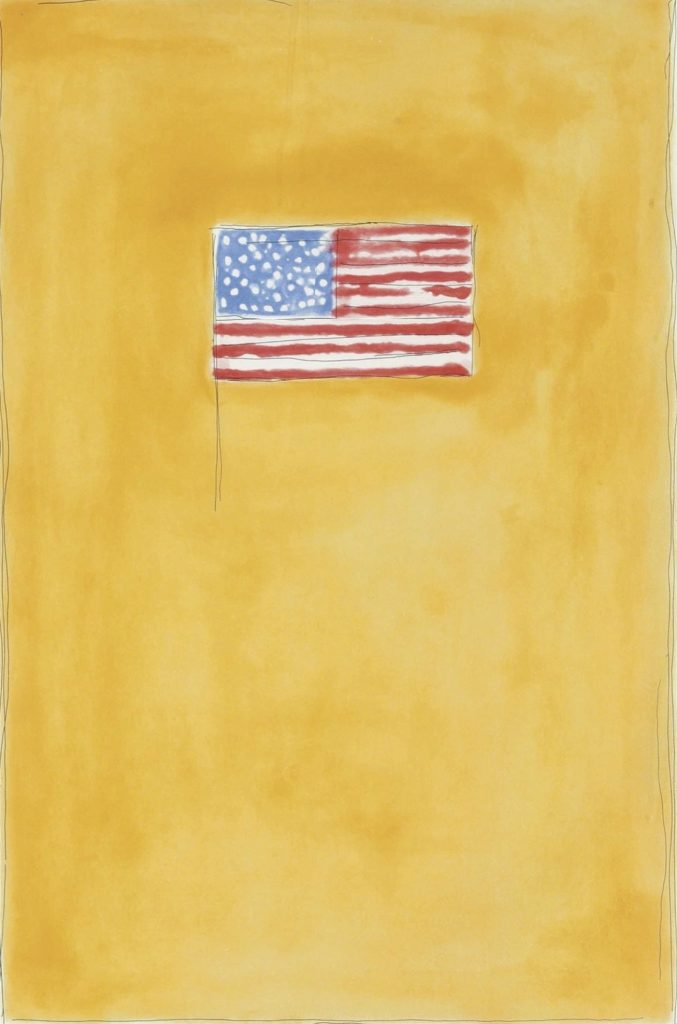
An Art of Changes: Jasper Johns Prints, 1960-2018 at Tampa Museum of Art through September 2021 is an encyclopedic retrospective of prints highlighting famous themes like flags, targets, and coffee cans stuffed with brushes by the American artist. The variety of flag images is inspirational and historic, yet this print caught my attention because of the warmth and happiness of the color way.
Flag on Orange, among the 350 artworks on display (the largest collection of Jasper Johns works in the Southeast) resonated with me because of the vibrance of primary and complimentary colors. Jasper Johns uses primary, red, blue, yellow, and complimentary, orange, green, and purple exclusively, a strong lesson in being selective and restrained in making art. The variety of color combinations and intensity brings the sprawling gallery to life bring a sense of freedom.
Two of the primary colors are represented in the flag, blue and red while yellow is washed through the orange color field. Purple vibrates through the red stripes and green slithers around the blue star field. At first glance it looks as if Johns broke his own rules but the six colors are all there. By pairing colors the artist lets the viewers eye fill in blanks, make associations and see for themselves.
Placing the flag in the upper half of the composition asserts the dominance of the symbol but staring at the stars and stripes a bit then looking at the bottom half a reverse image appears on the mottled orange background. This neat trick adds eye candy to the print while asserting the multiple levels of meaning in the US flag. There is also a symbolic code to the absence of the flag in the bottom half revealing disparity yet the equal but opposite ghost image tells the other half of the story.
Orange is a meaningful color, ‘joy, warmth, heat, sunshine, enthusiasm, creativity, success, encouragement, change…as well as creativity, emotional balance, sexuality, harmony, passion, freedom, intuition, and expression of emotions.’ All aspects of the human condition are embodied in the mixture of red and yellow; I find the color very relaxing and enjoyable and look for objects and art to add to my collection; at first they seem too bright but over time meld into the environment with a soothing glow.
This Fourth of July take a moment to stare at the flag and embrace how the colors represent more than the eye can see.
Like DoNArTNeWs Philadelphia Art News Blog on facebook
Follow DoN on Twitter @DoNNieBeat58
@donniebeat on Instagram
More DoNArTNeWs at www.brewermultimedia.com
Affiliate Marketing Disclosure Statement
Donate via safe and secure PayPal in the sidebar.


{ 0 comments… add one now }
You must log in to post a comment.